 Figpea
What's New in Figpea v4.2.2: Layer Constraints and a Cleaner Editor
Figpea opens and edits design files — Adobe XD, Photoshop (PSD/PSB), SVG, PDF, Figma, and more — right in your browser. Nothing installs, nothing uploads, and you don't need an account just to look at a file.
This is a patch release: no sweeping new capability, just one genuinely new authoring feature, a long-overdue clean-up of the editor's own interface, and a handful of fixes for things that were quietly wrong. Here's the whole of it.
Layer constraints: pin, stretch, or centre your children
If you've come from Figma, XD, or Sketch, you've been missing this: a way to say this bar stretches with the frame, this button stays pinned to the bottom-right, this logo stays centred. Until now Figpea had no per-layer constraint model at all — resizing a page left every child exactly where it was.
Every layer inside a page now carries a Constraints setting, right below Position in the inspector: a pin square plus a horizontal and a vertical control. The full Figma set is supported on both axes — Left, Right, Left and right (stretch), Center, and Scale horizontally; Top, Bottom, Top and bottom, Center, and Scale vertically. The two axes are independent, so a layer can be Right + Bottom and track the corner.
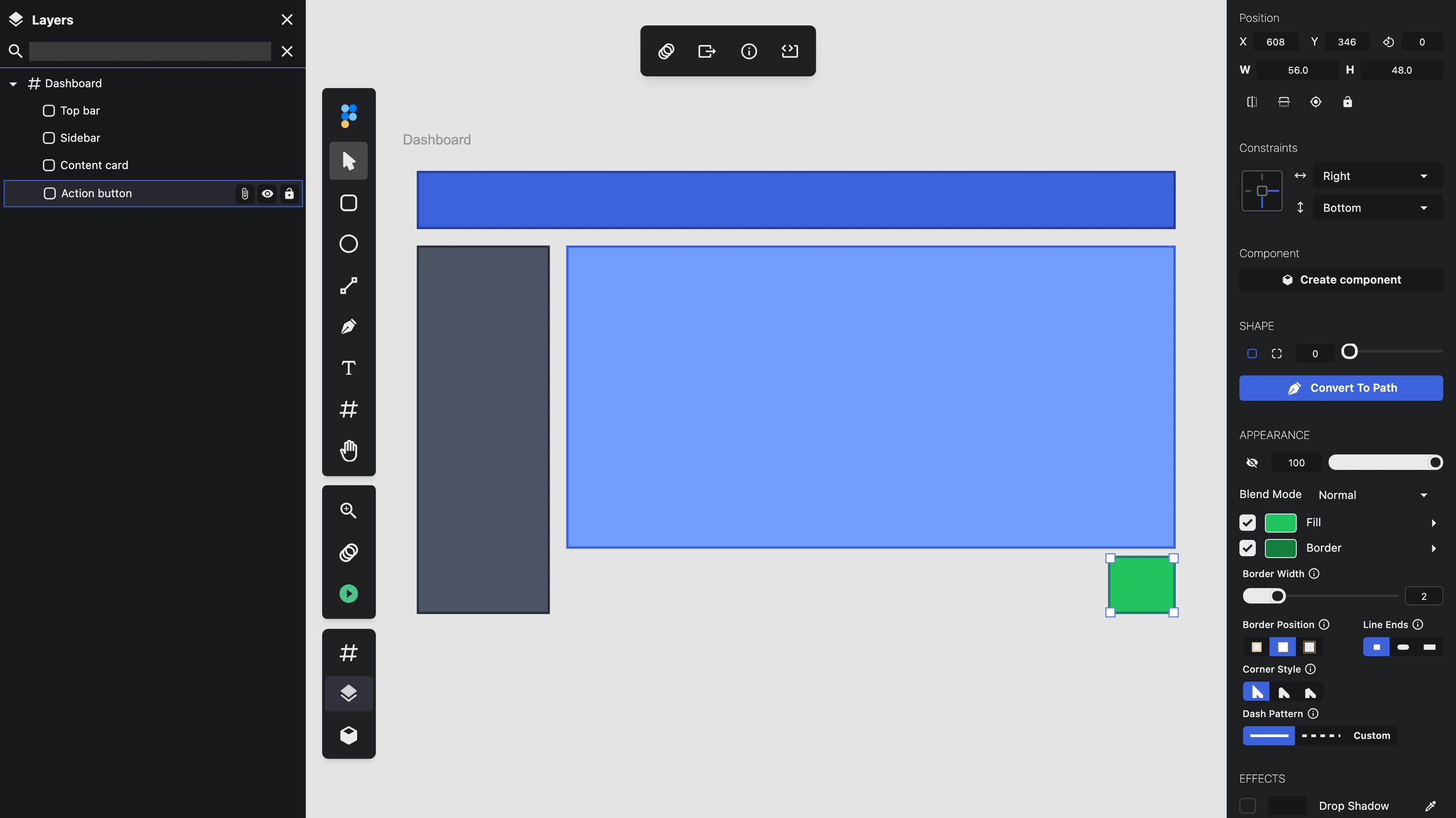
Reflow is opt-in per page, so nothing you already have changes. Select a page and its Layout section now offers Resize children: Fixed (today's behaviour, and still the default) or Constraints. Switch it on and dragging the page's resize handles reflows every child according to its own constraints. A few details worth knowing:
- The default for every layer is Left + Top, which means an all-default page in Constraints mode behaves exactly like a Fixed one. You opt in twice — once for the page, once per layer you actually want to move.
- The whole reflow is one undo step. Drag a page wider, press undo once, and the page size and every child that moved revert together — even on a slow, realistically-paced drag.
- Constraints persist: the page's mode and each child's horizontal/vertical setting survive saving and reopening a project, and still drive reflow afterwards.
- It holds up on real files, not just toy ones — we smoke-tested a page in Constraints mode inside a 4,600-layer imported document.
This release covers pages (artboards). Constraint mode for groups and folders, and reading or setting constraints from the scriptable window.figpea API, are the next two steps and aren't in this build.
A cleaner editor to work in
The complaint was blunt and fair: the properties panel's text was hard to read, and it didn't feel as crisp as Figma. The cause turned out to be that the editor had no design system of its own — the entire interface inherited a stock, general-purpose website theme. One mid-grey served for labels, values, section headers and button text alike, so nothing read as "the content"; input fields sat at a 1.06:1 contrast against the panel behind them, so they looked like dead zones rather than editable fields; dividers were smudges from a second, mismatched palette; and no font stack or tabular numerals were declared anywhere, so numeric columns wobbled as you dragged.
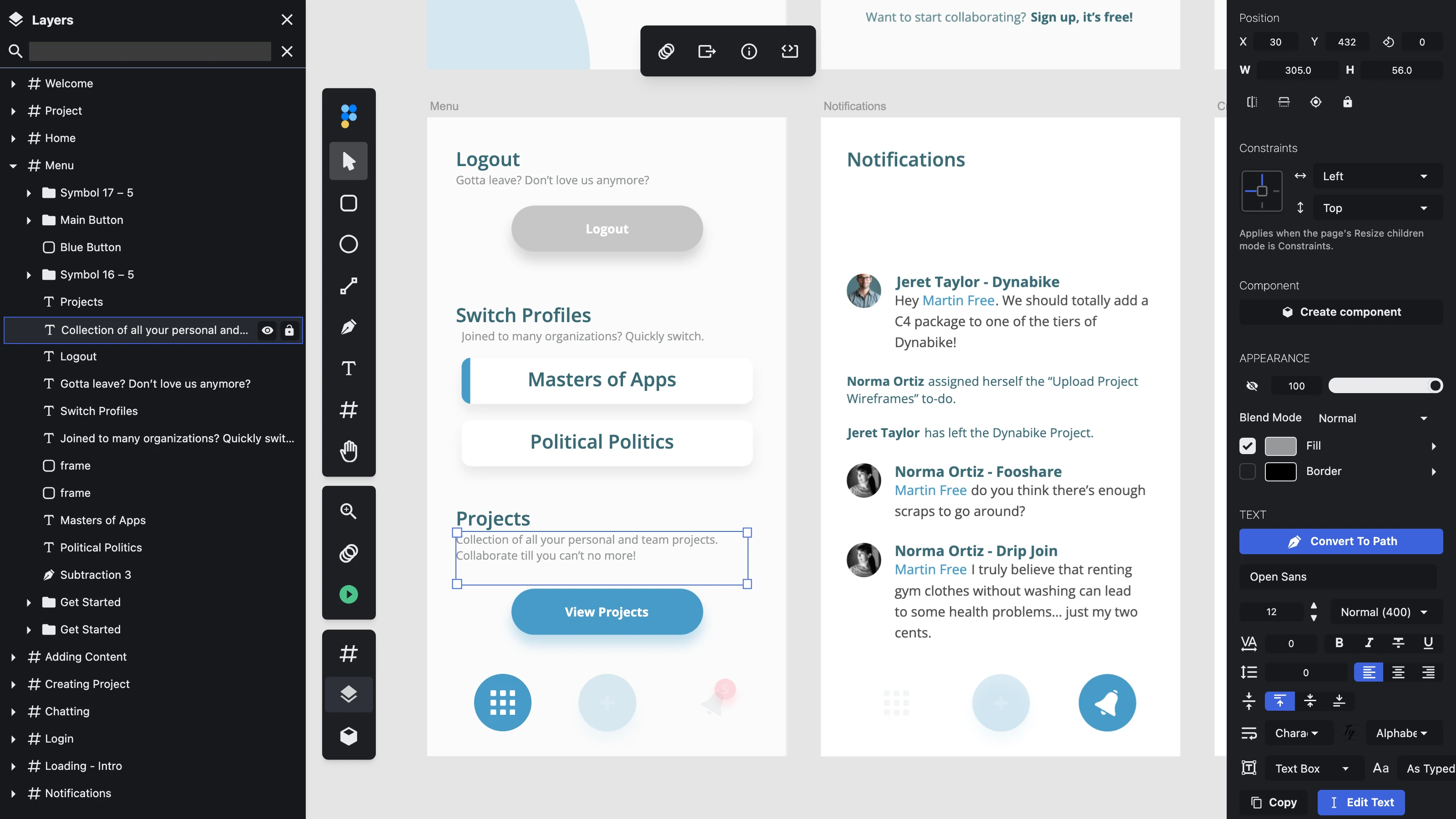
Figpea now has its own themes — dark and light, both first-class — built on a semantic token layer:
- A real text ramp instead of one grey. Primary values read close to white on dark (and near-black on light), labels sit a step back, and hints a step further, so the hierarchy is visible rather than uniform.
- Fields that look like fields. Input surfaces are properly separated from the panel behind them.
- Calmer, tighter shapes. 4px control radii (8px for menus and dialogs) instead of near-pill buttons, and no press-shrink wobble when you click.
- A declared system font stack with tabular numerals, so X/Y/W/H, opacity and font-size columns stop shifting as the digits change. Notably, no webfont was added and no JavaScript — the whole re-skin costs about 2 KB of extra CSS.
- A denser panel type size (11px), closer to the density you'd expect from a design tool.
This is deliberately the foundation phase: it re-skins the whole interface from one config file, with zero markup changes and no JavaScript added. Per-component refinement — section headers, field borders, toggle states, control alignment — is queued behind it.
Components: one section, real state names, and instances that follow
Three fixes here, all in the same corner of the product.
The component inspector now reads as one thing. The component/instance header and the States list used to be split by a divider, so States looked like its own block sitting next to Boolean Operation rather than part of the component it describes. Header and States are now presented as a single section, with Boolean Operation clearly separated below it.
An instance's master reference is now a link. The "of <master>" subtitle under an instance used to be inert text. Activating it — by click or from the keyboard — selects the master component, switches the left panel to the Components tab, and scrolls the master's row into view, so the inspector then shows the master's properties. It deliberately doesn't move your canvas viewport or enter an isolation mode. Instances whose master can't be resolved still show a plain, non-interactive "of its component".
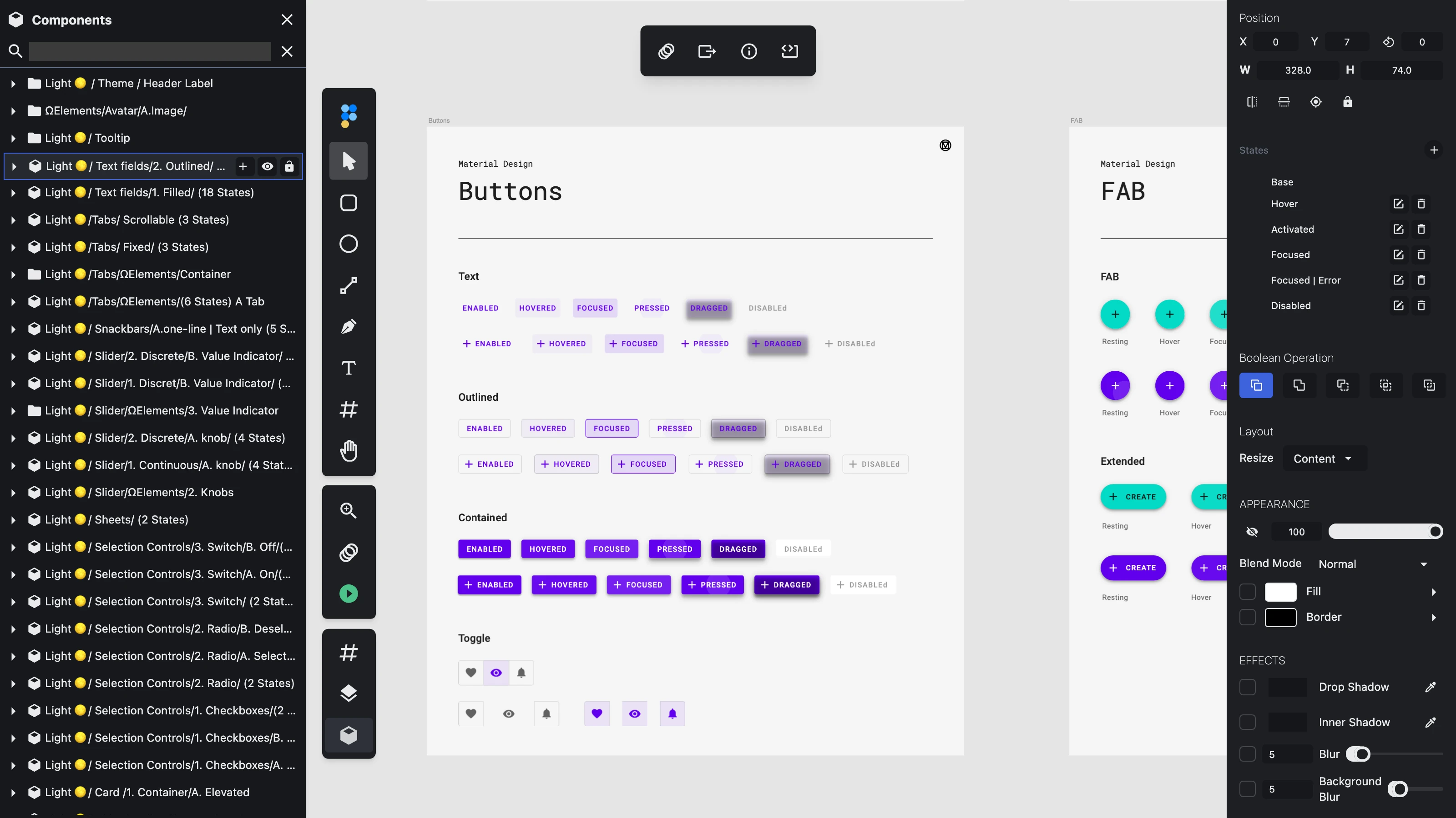
Imported Adobe XD component states have their names back. XD components carry a default state plus named ones — Hover, Focused, Pressed, Disabled. The states themselves were importing correctly, but the name was being dropped, so every non-default state rendered as a blank row in the inspector. This bites design-system kits hardest: in one Material Design file we tested, 76 of its 145 component masters carry named states — 281 of them — and every single label came through empty. They now read exactly as the file authored them, with the default state still labelled Base.
And one instance-fidelity bug: converting a master rectangle to a path and then editing that path left every instance stuck drawing the original rectangle. The instance's geometry now follows its master across that conversion and any later path edits — consistent with how an instance of a native Path layer already behaved. For path geometry, the master always wins.
The file picker that quietly dropped your file
Two separate reports — "the welcome screen's Browse File button does nothing" and "image stopped working in layer fill" — turned out to be the same bug in the same function, and it's fixed.
Figpea's file picker resolved on one of three signals: the file input's change event, its native cancel event, or — as a fallback for older browsers — a timer that fired 100ms after the window regained focus and assumed you'd cancelled. The flaw is that the window regains focus whether you picked a file or cancelled. So whenever change arrived more than about 100ms after focus, the cancel fallback won the race and the picker reported "cancelled" for a file you had actually chosen. Nothing opened, and no error appeared — because the open pipeline never ran at all.
Worth saying how this one went, because the first fix wasn't enough. We initially tightened the timer so it would only report a cancellation when the file list was genuinely empty. That looked right and passed every automated test — but the automation couldn't reproduce the bug at all: driving a browser programmatically delivers the file list and the change event together, which is precisely what real browsers don't do. Checking by hand in a real Chrome showed the file list is still empty at the 100ms mark and only fills in around 270ms later, so the picker kept losing files.
So the timer is gone entirely. The picker now relies on the change event for a pick and the browser's native cancel event for a cancellation — no guessing from window focus, no race to lose. Verified by hand in a real browser, not just in CI. All three callers are fixed together: the welcome screen's Browse File, the in-editor open file command, and the layer fill → Image picker. A genuine cancel still resolves as a cancel and still opens nothing.
On the site: your Rescue Pass, and a docs page you can scan
An active Rescue Pass now shows up on /account. The Rescue Pass is a one-time purchase, so it lives as an entitlement rather than a recurring Stripe subscription — and the account page only ever asked Stripe for subscriptions. Pass holders were shown "No active subscription. Upgrade to Pro to unlock all features!", which reads, to someone who just paid, like the purchase failed. The entitlement itself was always correct: the editor honoured the pass the whole time. This was a display gap on one surface, and it's closed.
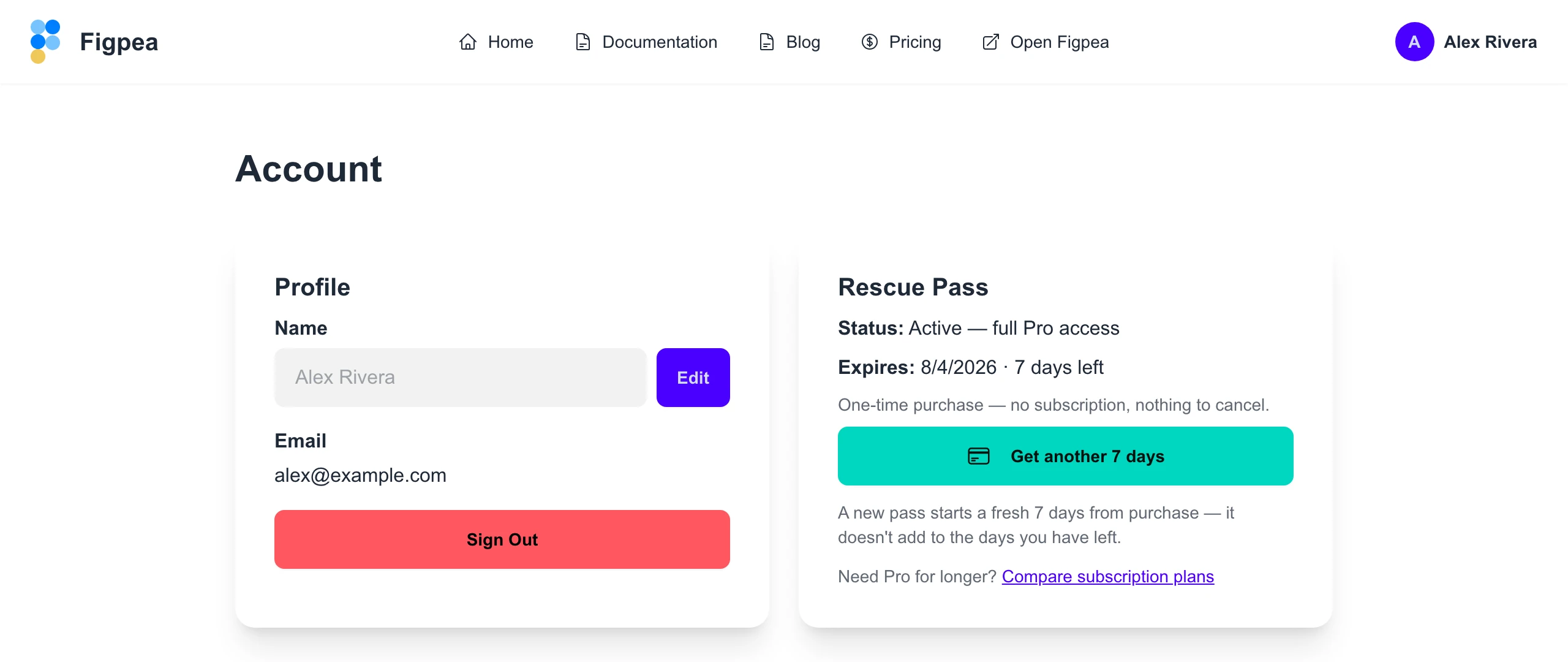
The card now names the pass, confirms Pro is active, and shows when it expires and how many days are left. Because a one-time pass has nothing to manage in the billing portal, the "Manage Subscription" button is replaced with a renew action — plus a plain note that a new pass starts a fresh window rather than stacking onto the days you have left. Subscribers and free accounts see exactly what they saw before.
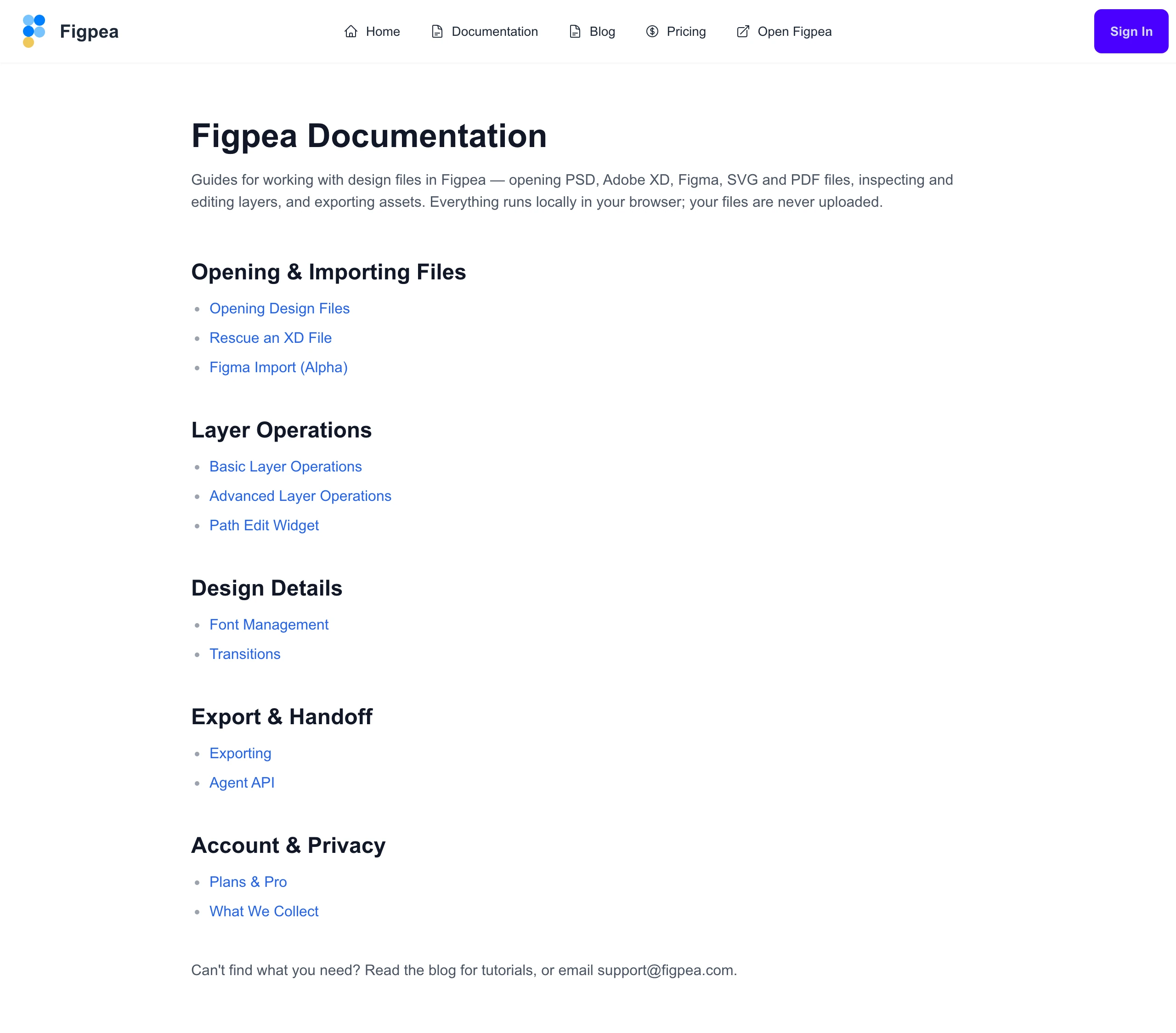
And /docs is a directory again. It used to be a long prose welcome page with an always-visible flat list of every article in a sidebar. It's now a scannable, help-centre-style index: a short intro, then five named sections — Opening & Importing Files, Layer Operations, Design Details, Export & Handoff, and Account & Privacy — each a plain list of its articles. Every article URL is unchanged, and the individual article pages keep their own navigation.
Try it
Everything above is live now. Open Figpea, drag in an XD, PSD, SVG, PDF, or Figma file — or load a built-in sample — and have a look. It's free to open, inspect, and edit; when you need batch export, any-scale asset extraction, and unlimited presentations, Pro has you covered.