 Figpea
The editor interface — and how to find out what a button does
Most of the editor is icons. That is a good thing once you know them and an annoying thing on the first afternoon, so this page is two things at once: a map of what lives where, and the answer to "what does this button do" without clicking it and finding out.
When a control in the editor has a hover tip, the tip does the same job every time: it names the control, says what it does, and gives its keyboard shortcut when it has one. A control that already carries visible text of its own — a named field, a button that reads as a sentence — deliberately has no tip.
What is on the screen
The editor is built out of a fixed set of regions. Every one of them is chrome.
| Region | Where it is | What it holds |
|---|---|---|
| Canvas | The middle | The sheet you are working on, drawn at the current zoom |
| Top bar | The strip along the top | Zoom control, main menu, the present button |
| Tool rail | The vertical strip at the left edge | The tools you draw and select with |
| Panel tabs | The small vertical rail beside the left panel | Pages, Layers, Components, Assets — the left panel's four faces |
| Left panel | Under the panel tabs | The tab you picked: layer list, sheet list, component list, asset list |
| Pane header | The top of the left panel | The panel's own name, its actions, and the button that closes it |
| Inspector | The right panel | Everything about the layer you selected — position, fills, strokes, effects, text |
| Menu bar | Behind the Figpea logo at the top left | File and edit commands, language, plan, account, links |
| Notices and popups | Floating over the canvas, and modal dialogs | Connection state, offline state, plan warnings, render progress, task popups |
The regions do not move between sessions: the same control is in the same place on every project, and the same control does the same thing in every project.
Hover a control and it tells you what it does
When a control carries a hover tip, hovering it shows a bubble beside the control, inside the editor — the same bubble, doing the same job.
 Hovering the zoom control: the bubble names the control and says what it does. Every tip in the editor
names its control the same way.
The bubble is anchored to the control it describes and it is placed on the side with room, so it never sits under a panel edge or off the window — including in a narrow window and in every language the editor ships in.
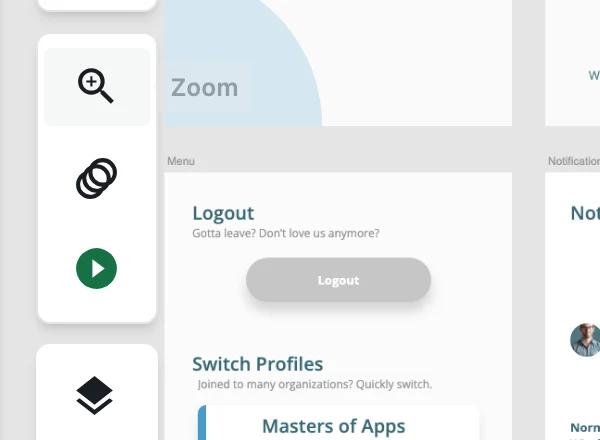 The same control in a narrow window. The tip moves to the side that has room instead of being clipped
by the window edge.
It is not a mouse-only affordance either — tab to a control and the tip appears the same way.
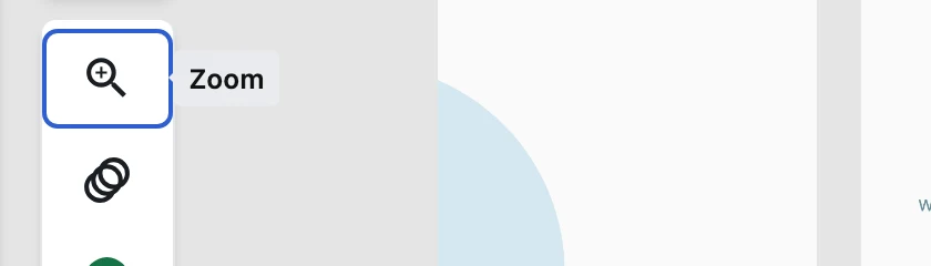 Tabbing to a control reveals its tip. Keyboard users get the name and the shortcut too.
If a control has no tip
The reasons a control carries no tip — each a decision rather than an oversight:
- It has visible text. "Import", "Replace", "Fit width": the words are already on screen, so a hovering copy of the same words would be noise. This is why some buttons have tips and their neighbours do not.
- It is a field, not a button. A text field or a number field is named by the label beside it or by its placeholder. A bubble is for a control whose whole identity is a symbol.
- It is part of the drawing, not the chrome. Selection handles, rotation anchors and the widgets that sit on the canvas are positioned in the canvas's own coordinate space. A bubble anchored to one would be painted in the wrong place, so canvas-space handles carry no tip by design.
- It is text that is being truncated. A long layer name that the panel shortens keeps a native tooltip so you can read the rest of it. That is a read-out, not a control explanation.
Where the shortcuts are written down
A tip names a control's shortcut when it has one, in the same place every time — at the end of the
sentence, in parentheses. So Zoom In with a binding reads as the action followed by the keystroke,
and the keystroke is the one that actually fires: a menu item's chip and the tip on the same control
never disagree, because they are the same value.
Shortcuts are shown in the form your platform uses — ⌘ on macOS, Ctrl elsewhere — and combinations
keep a plain + between the parts on both.
Frequently asked questions
Why does an icon-only control show a tip but a labelled one does not? A tip exists to name a control that has no name on screen. An icon-only button is silent until you hover it; a control that already reads as a sentence has its explanation on screen already, so a hovering duplicate would be noise.
Can I change the keyboard shortcuts the tips show? No. Figpea has no shortcut editor. A tip shows the shortcut that is actually bound; it does not let you rebind it.
Do tips work on a phone or a tablet? A tip is a hover affordance, and a touch screen has no hover. On a phone the editor switches to its own layout with visible labels on the action bar, so the controls you would hover on a desktop are already named there.
Do tips appear when I use the keyboard? Yes — tabbing to a control reveals the same bubble hovering it would, which matters because the keyboard user needs the shortcut name as much as the mouse user.
Do I have to wait for a tooltip, and can I turn them off? There is nothing to install or switch on: the bubble appears while you hover and disappears when you move away. There is no setting to disable it: it is part of the chrome, not an optional overlay.
Where to go next
- Opening design files — what the editor accepts and what it does with it
- Basic layer operations — selecting, moving, renaming, deleting
- Your projects — where work is stored and how to get back to it
- Change the editor language — the chrome, and the tips, in seven languages
- Font management — the font list, uploading, and substitution
- Exporting — PNG, JPG, SVG, WebP and PDF